Device database · 172 models · 18 brands
All devices: CSS viewport, density, and screen resolution
Smartphones, tablets, computers, and smartwatches, each with the width your media queries rely on, its pixel density, and its panel resolution. 81 of these devices can be tested directly in your browser.
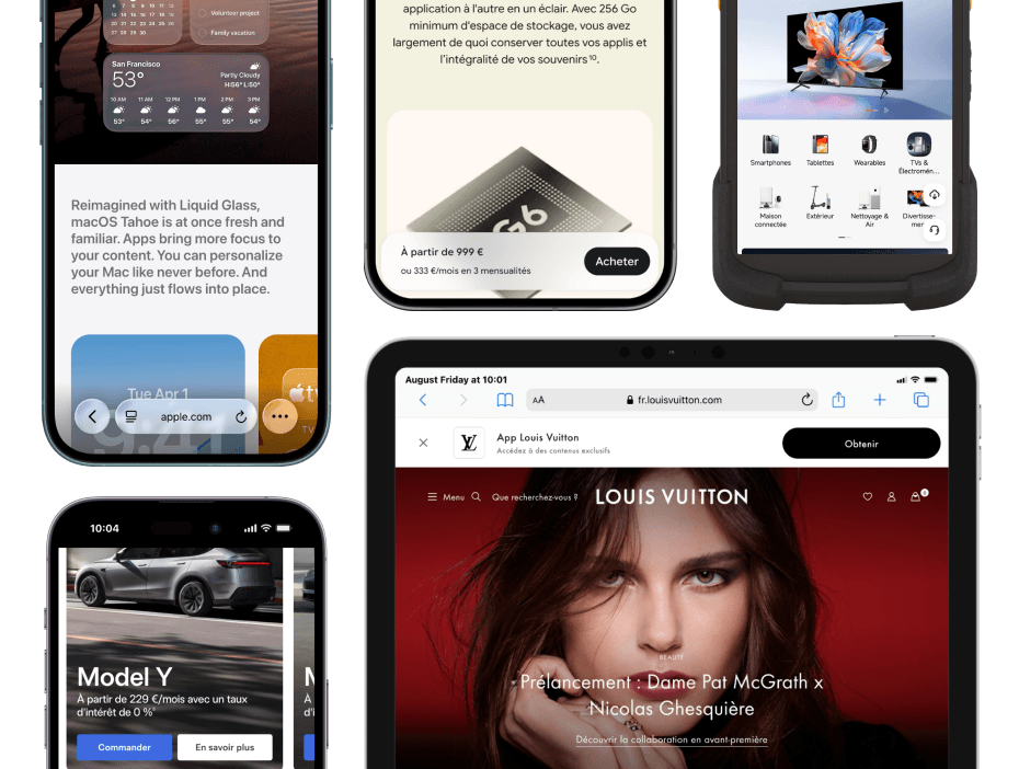
Devices by brand
Each model leads to its sheet: CSS viewport, pixel density, manufacturer resolution, diagonal, User-Agent, and ready-to-copy media queries. The search filters by name, brand, pixel width, or year.
172 devices displayed
 Samsung Smartphones 53 models
- Galaxy S26 ULTRA
- Samsung Galaxy A17
- Samsung Galaxy S24 (2024)
- Samsung Galaxy S24 Ultra (2024)
- Samsung Galaxy S22 (2022)
- Samsung Galaxy S22 ULTRA (2022)
- Samsung Galaxy S22+ (2022)
- Samsung Galaxy A12
- Samsung Galaxy S21
- Samsung Galaxy S21 Ultra
- Samsung Galaxy S21+
- Samsung Galaxy Z Flip3 (2021)
- Samsung Galaxy A71
- Samsung Galaxy Note20
- Samsung Galaxy Note20 Ultra
- Samsung Galaxy S10 Lite
- Samsung Galaxy S20
- Samsung Galaxy S20 FE
- Samsung Galaxy S20 Ultra
- Samsung Galaxy S20+
- Samsung Galaxy Z Flip
- Samsung Galaxy Z Fold 2 unfolded (2020)
- Samsung A50
- Samsung Galaxy A30
- Samsung Galaxy A50s
- Samsung Galaxy A51
- Samsung Galaxy A70s
- Samsung Galaxy Fold (2019)
- Samsung Galaxy S10
- Samsung Galaxy S10+
- Samsung Note10
- Samsung Note10+
- Samsung Galaxy A6s
- Samsung Galaxy J4
- Samsung Galaxy J6
- Samsung Galaxy J7 Prime2
- Samsung Galaxy J8
- Samsung Galaxy Note9
- Samsung Galaxy S9
- Samsung Galaxy S9+
- Samsung Galaxy J7 Pro
- Samsung Galaxy Note8
- Samsung Galaxy S8
- Samsung Galaxy S8+
- Samsung Galaxy J5 Prime
- Samsung Galaxy J7 Prime
- Samsung Galaxy On8
- Samsung S7
- Samsung S7 edge
- Samsung Galaxy J5
- Samsung Galaxy J7
- Samsung S6
- Samsung S6 edge
Samsung Tablets and computers 3 models
 Apple Smartphones 45 models
- Apple iPhone 18 PRO (2026)
- Apple iPhone 18 PRO MAX (2026)
- Apple iPhone Duo folded (2026)
- Apple iPhone Duo unfolded (2026)
- Apple iPhone 17 (2025)
- Apple iPhone 17 PRO (2025)
- Apple iPhone 17 PRO MAX (2025)
- Apple iPhone Air (2025)
- Apple iPhone 16 (2024)
- Apple iPhone 16 Plus (2024)
- Apple iPhone 16 PRO MAX (2024)
- Apple iPhone 15 (2023)
- Apple iPhone 15 Plus (2023)
- Apple iPhone 15 PRO (2023)
- Apple iPhone 15 PRO MAX (2023)
- Apple iPhone 14 (2022)
- Apple iPhone 14 Plus (2022)
- Apple iPhone 14 PRO (2022)
- Apple iPhone 14 PRO MAX (2022)
- Apple iPhone 13 (2021)
- Apple iPhone 13 Mini (2021)
- Apple iPhone 13 PRO (2021)
- Apple iPhone 13 PRO MAX (2021)
- Apple iPhone 12
- Apple iPhone 12 Mini
- Apple iPhone 12 Pro
- Apple iPhone 12 Pro Max
- Apple iPhone SE (2020)
- Apple iPhone 11
- Apple iPhone 11 Pro
- Apple iPhone 11 Pro Max
- Apple iPhone SE (2018)
- Apple iPhone X (2018)
- Apple iPhone XR
- Apple iPhone XS Max
- Apple iPhone 8
- Apple iPhone 8 Plus
- Apple iPhone 7
- Apple iPhone 7 Plus
- Apple iPhone 6s
- Apple iPhone 6s Plus
- Apple iPhone 6
- Apple iPhone 5c
- Apple iPhone 5s
- Apple iPhone 5
Apple Tablets, computers and smartwatches 8 models
 Google 17 models
 OnePlus 11 models
 Huawei 9 models
 Xiaomi 6 models

Generic Devices 2 models
HTC 2 models
 Motorola 2 models
 Sony 2 models
 Zebra 2 models
 Dell 1 model
 Infinix 1 model
LG 1 model
Microsoft 1 model
 OPPO 1 model
Sonoff 1 model
Latest devices added


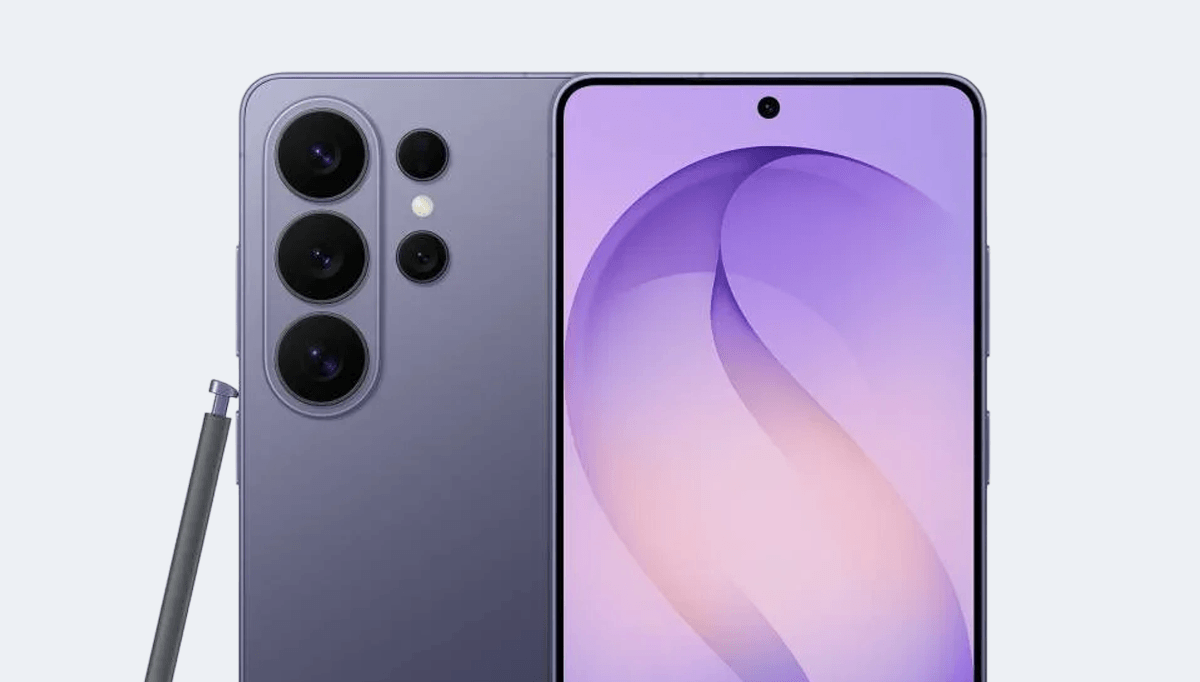
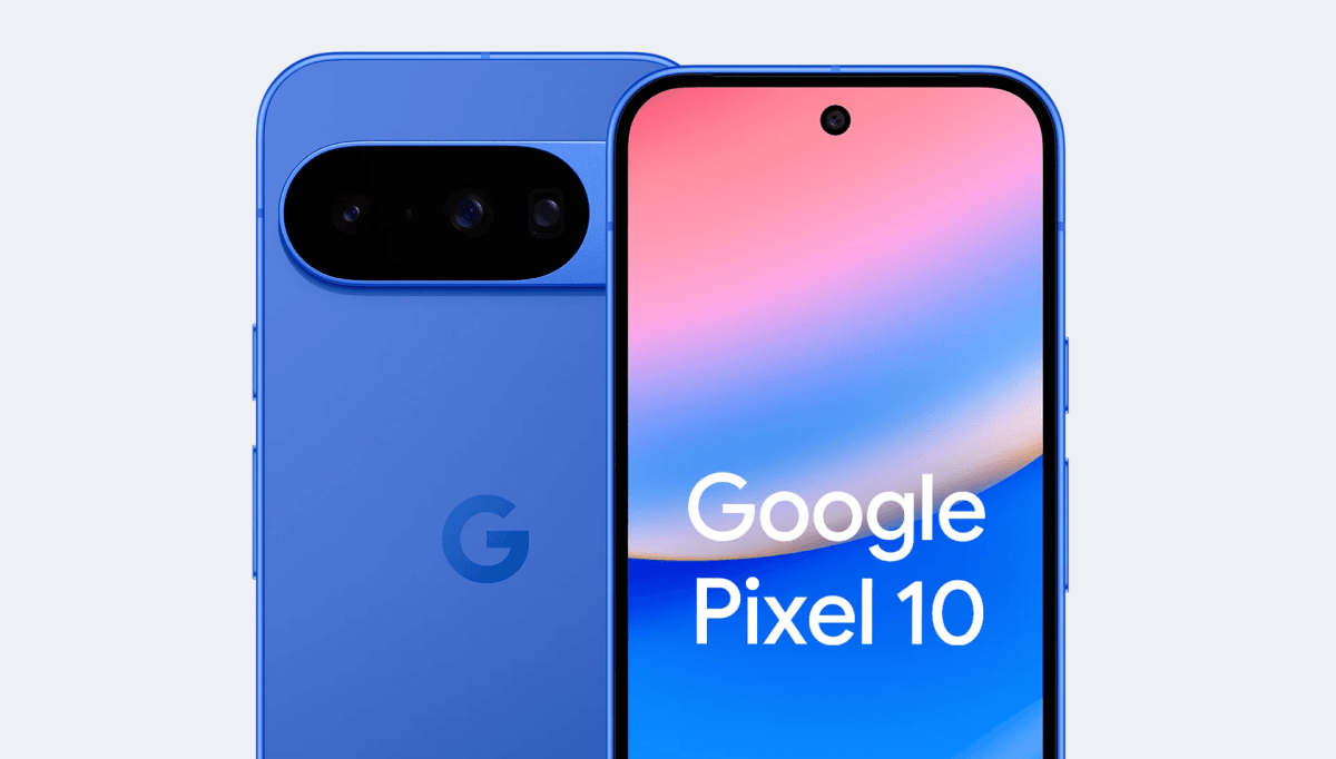
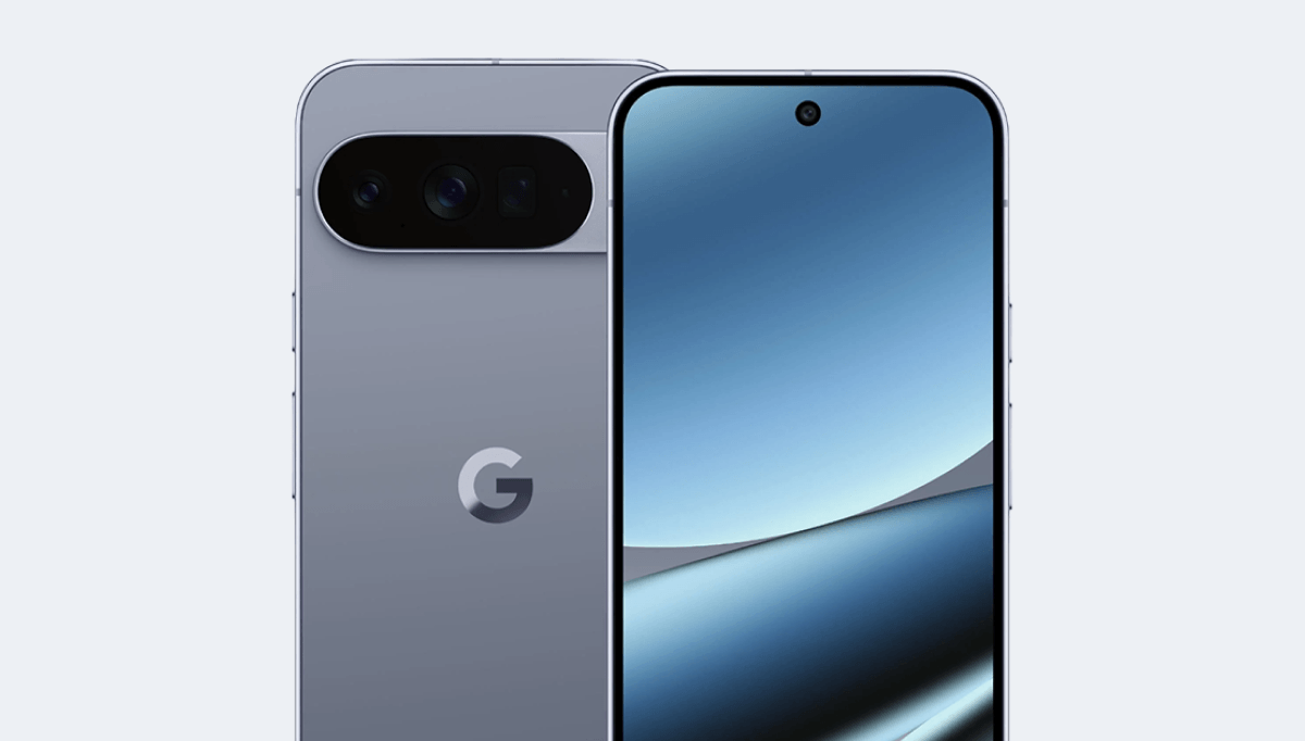
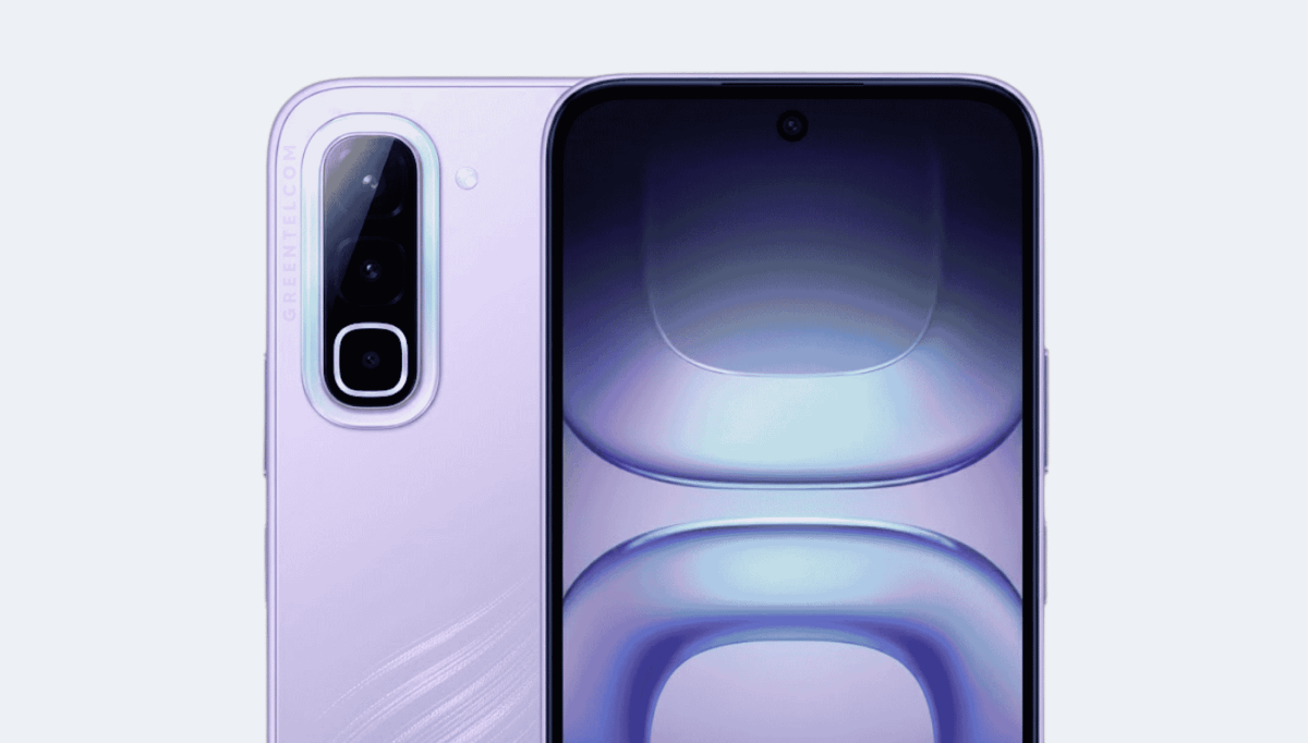
Test your site on a real device without buying it
Three steps, about thirty seconds, no account to create.
- 01 Install the extension It adds to Chrome, Edge, Firefox, Safari, or Opera with one click, no account needed.
- 02 Choose the device 81 models are ready to use, with their exact CSS viewport, pixel density, and User-Agent.
- 03 Open your site alongside The rendering appears in the device frame, including on a localhost address, and you can export a screenshot or video.
How to read a device's characteristics
The CSS viewport is the only one of the three measurements your stylesheet handles. It's the width your breakpoints compare to, deciding the number of columns displayed and the image version served. An iPhone 16 advertised at 1179 pixels by its manufacturer actually works on 393 CSS pixels: it's this second value that should be written in a media query.
Pixel density, or device pixel ratio, is the ratio between the two. At 3x, each CSS pixel is rendered by nine physical pixels: an image exported at its display size will appear softened, and a version two or three times larger should be provided. The manufacturer resolution is only used to prepare these exports and read audience statistics, never to write CSS.
The diagonal and ratio complete the picture: two devices with the same viewport can have very different heights, which changes everything for a sticky menu or a footer banner. That's why each sheet also provides a list of models with strictly identical formats: validating one of them is enough to validate the others.
Frequently asked questions
What is a device's CSS viewport?
It's the width, in CSS pixels, of the browser's display area on that device. It's the value your media queries compare to, and it's almost always smaller than the resolution advertised by the manufacturer.
What's the difference between CSS viewport and screen resolution?
Resolution is the number of physical pixels on the panel, the CSS viewport is the logical width your stylesheet works with. The ratio between the two is pixel density: a 1179-pixel screen at 3x density offers 393 CSS pixels.
What widths should be targeted for breakpoints?
Among the 172 referenced devices, the most represented widths are 360 px, 412 px, 393 px. Checking these first covers the majority of the mobile market before adding finer breakpoints.
Why does a foldable smartphone have two pages?
Because it has two viewports. The cover screen and the inner screen share neither width, height nor aspect ratio: a layout validated folded is not validated unfolded, and the device switches from one to the other mid-session. Each state therefore has its own page and its own media queries.
How to test your site on these devices?
With the Mobile FIRST extension: it replicates the viewport, pixel density, User-Agent, and touch events of 81 of these models, directly in your browser, including on a localhost address.
Is the list up to date?
Yes. The catalog includes 172 models across 18 brands, and it's updated with each new device release.
Test your site on 81 of these devices without buying a single one
The table provides the measurements. The extension displays your site at the device's exact viewport, with its User-Agent and touch events.
- 81 devices ready to use, from older models to this year's releases
- Screenshots and videos exported in the device's format
- Works on your local environments and pre-productions
Free · 4.9/5 on 5,100 reviews
1,500,000+ users