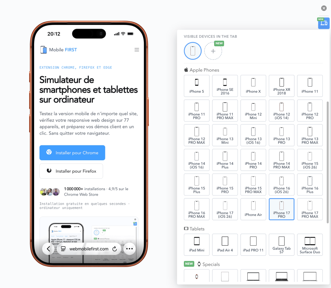
31 simulatable iPhones · 320 to 440 px · portrait and landscape

Online iPhone Simulator: test your site without a device

The extension reproduces in your browser the CSS viewport, pixel density, User-Agent, and touch gestures of 31 iPhones, from 320 to 440 px wide. The table provides the measurements of each model, and each line links to its complete sheet.

1,500,000+ installations · 4.9/5 on the Chrome Web Store

Free installation in seconds · computer only

An iPhone displaying a mobile version site in the Mobile FIRST simulator, with the Safari iOS navigation bar

Why test your site on iPhone?

11 CSS widths in a single range

The 31 iPhones in the simulator are spread over 11 different widths, from 320 to 440 px. Validating the one you have on hand says nothing about the 10 others: it's from one model to another, not from one brand to another, that the layout breaks.

Density of 2x or 3x

Depending on the generation, each CSS pixel is rendered by 2 or 3 physical pixels: 11 models at 2x, 30 at 3x. A sharp image on the former appears blurry on the latter if you don't serve a high-resolution version.

Portrait and landscape

Switched to landscape, a recent iPhone reaches 956 px wide and triggers the breakpoints you reserved for tablets. It's the least tested orientation, and the one where fixed headers eat up half the screen.

How to simulate an iPhone in three steps

No Mac, no account, no system image download: the simulator applies to the open tab.

  1. 01 Install the extension On Chrome, Firefox, or Edge, from the official store. Free, no account creation required.
  2. 02 Choose an iPhone from the list The 31 models are sorted by generation, from newest to oldest. The site reloads with the viewport and User-Agent of the chosen model.
  3. 03 Compare generations, capture Display two iPhones side by side to see where the layout breaks, switch to landscape, export a cropped screenshot or a video.

The 31 iPhones in the simulator

31 models · 2012 → 2025

11 distinct CSS widths cover the entire selection: 320, 360, 375, 390, 393, 402, 414, 420, 428, 430 and 440 px. Several models share the same one: validating one of them is enough to validate the others, and the table shows which ones.

CSS viewport, pixel density, resolution, and diagonal of simulatable iPhones
Model CSS Viewport Density Panel resolution Diagonal Year
Apple iPhone 17 402 × 874 3x 1206 × 2622 6.3" 2025
Apple iPhone 17 PRO 402 × 873 3x 1206 × 2622 6.3" 2025
Apple iPhone 17 PRO MAX 440 × 956 3x 1320 × 2868 6.9" 2025
Apple iPhone Air 420 × 912 3x 1260 × 2736 6.5" 2025
Apple iPhone 16 393 × 852 3x 1179 × 2556 6.1" 2024
Apple iPhone 16 Plus 430 × 932 3x 1290 × 2796 6.7" 2024
Apple iPhone 16 PRO MAX 440 × 956 3x 1320 × 2868 6.7" 2024
Apple iPhone 15 393 × 852 3x 1179 × 2556 6.1" 2023
Apple iPhone 15 Plus 430 × 932 3x 1290 × 2796 6.7" 2023
Apple iPhone 15 PRO 393 × 852 3x 1179 × 2556 6.1" 2023
Apple iPhone 15 PRO MAX 430 × 932 3x 1290 × 2796 6.7" 2023
Apple iPhone 14 390 × 844 3x 1170 × 2532 6.1" 2022
Apple iPhone 14 Plus 428 × 926 3x 1284 × 2778 6.7" 2022
Apple iPhone 14 PRO 390 × 844 3x 1179 × 2556 6.1" 2022
Apple iPhone 14 PRO MAX 428 × 928 3x 1290 × 2796 6.7" 2022
Apple iPhone 13 390 × 844 3x 1170 × 2532 6.1" 2021
Apple iPhone 13 Mini 375 × 812 3x 1080 × 2340 5.4" 2021
Apple iPhone 13 PRO 390 × 844 3x 1170 × 2532 6.1" 2021
Apple iPhone 13 PRO MAX 428 × 926 3x 1284 × 2778 6.7" 2021
Apple iPhone 12 390 × 844 3x 1170 × 2532 6.1" 2020
Apple iPhone 12 Mini 360 × 780 3x 1080 × 2340 5.4" 2020
Apple iPhone 12 Pro 390 × 844 3x 1170 × 2532 6.1" 2020
Apple iPhone 12 Pro Max 428 × 926 3x 1284 × 2778 6.7" 2020
Apple iPhone SE 375 × 667 2x 750 × 1334 4.7" 2020
Apple iPhone 11 414 × 896 2x 828 × 1792 6.1" 2019
Apple iPhone 11 Pro 375 × 812 3x 1125 × 2436 5.8" 2019
Apple iPhone 11 Pro Max 414 × 896 3x 1242 × 2688 6.5" 2019
Apple iPhone SE 320 × 568 2x 640 × 1136 4" 2018
Apple iPhone X 375 × 812 3x 1125 × 2436 5.8" 2018
Apple iPhone XR 414 × 896 2x 828 × 1792 6.1" 2018
Apple iPhone 5 320 × 568 2x 640 × 1136 4" 2012

Which iPhone widths to test first

The most represented widths in the range are 375, 390 and 428 px. Checking them first covers 14 of the 31 models in the table: your first breakpoints should fall on them before adding more.

Go down to 320 px to cover the entire range, including Apple iPhone 5: a layout that holds at this width holds on all iPhones in circulation. Recent models go up to 440 px, a gap of 120 px between the two extremes.

On models with a notch or Dynamic Island, the usable area does not start at the edge of the screen. Declare viewport-fit=cover then reserve the margin with the variables env(safe-area-inset-top) and env(safe-area-inset-bottom): without them, a fixed bar at the bottom of the page goes under the system's home bar.

Beware of the height under Safari iOS: interface bars reduce the visible area and retract when scrolling. A height of 100vh thus overflows the first screen; the svh and dvh units give the actual displayed value.

iPhone Simulator, Xcode Simulator or DevTools?

The Xcode simulator runs a real iOS and a real Safari: it's the only way to reproduce a WebKit rendering engine bug. It requires a Mac, several gigabytes of download, and it doesn't open in the middle of an integration session.

The responsive mode of DevTools resizes the browser window and changes the User-Agent. It's an inspection tool: no device frame, no realistic touch gestures, one screen at a time, and nothing to show a client.

Mobile FIRST stands between the two. It reproduces the viewport, density, User-Agent, and touch events of 31 iPhones in the browser you already have open, on Windows, macOS, or Linux, and displays multiple models side by side. The rendering engine remains that of your browser: to validate a WebKit-specific behavior, a real device or Apple's simulator is still necessary.

Test your site on 31 iPhones without buying a single one

The tables provide the measurements. The extension displays your site at the model's exact viewport, with its density, User-Agent, and portrait or landscape switch.

  • 31 iPhones ready to use, from iPhone 5 to this year's releases
  • Real viewport, pixel density, and iOS User-Agent
  • Two generations side by side to spot regressions
  • Works on localhost and preproduction

Free · 4.9/5 on 5,100 reviews
1,500,000+ users

Frequently asked questions

What is the CSS viewport of an iPhone?

It depends on the model and ranges from 320 to 440 px wide on the 31 iPhones in the simulator. The most common value is 390 px, shared by 6 models. It's this width in CSS pixels, not the panel resolution, that your media queries read.

Does the simulator really use Safari?

No, and it's important to know: it reproduces the viewport, pixel density, User-Agent, and touch gestures of the iPhone in your browser's engine. This covers layout, breakpoints, and touch behavior. For a WebKit engine-specific bug, a real device or the Xcode simulator is needed.

Can you simulate an iPhone without a Mac?

Yes. The extension installs on Chrome, Firefox, and Edge, on Windows, macOS, and Linux. Unlike the Xcode simulator, it requires neither Apple hardware nor system image download.

How many iPhones are available in the extension?

31 preconfigured models, from the newest to the oldest, updated with each release. The 10 other iPhones in the catalog each have their technical sheet on the site: enter their width and density in a custom device to find them in the list.

What User-Agent does the simulator announce?

That of the chosen device, as it actually sends it. For Apple iPhone 17 under iOS 26.0, it is: Mozilla/5.0 (iPhone; CPU iPhone OS 26_0 like Mac OS X) AppleWebKit/605.1.15 (KHTML, like Gecko) Version/26.0 Mobile/15E148 Safari/604.1. Servers and detection scripts thus see an iPhone, not your desktop browser.

How to test the notch and Dynamic Island?

The simulator applies the model's safe margin: a layout that ignores env(safe-area-inset-bottom) reveals the issue as on the device. Declare viewport-fit=cover in the viewport tag for these variables to take effect.

Can you test a site on localhost on a simulated iPhone?

Yes. The extension applies to the current tab regardless of the URL: production, preproduction, or local server during development. This distinguishes it from online simulators, which do not see your machine.

An iPhone is missing from the list, what to do?

Create a custom device with the width, height, and density from the corresponding sheet, then save it: it joins the list and behaves like the preconfigured models.

iPhone, iPad, Safari, and Xcode are trademarks of Apple Inc. Mobile FIRST is neither affiliated with nor endorsed by Apple.