31 Android devices · 9 manufacturers · 360 to 884 px

Online Android emulator: test your site on Pixel, Galaxy, and Xiaomi

The extension turns your browser into an Android emulator: it reproduces the CSS viewport, pixel density, User-Agent, and touch gestures of 31 Android devices from 9 manufacturers, ranging from 360 to 884 px wide. No SDK to install, no system image to download.

1,500,000+ installations · 4.9/5 on the Chrome Web Store

Free installation in seconds · computer only

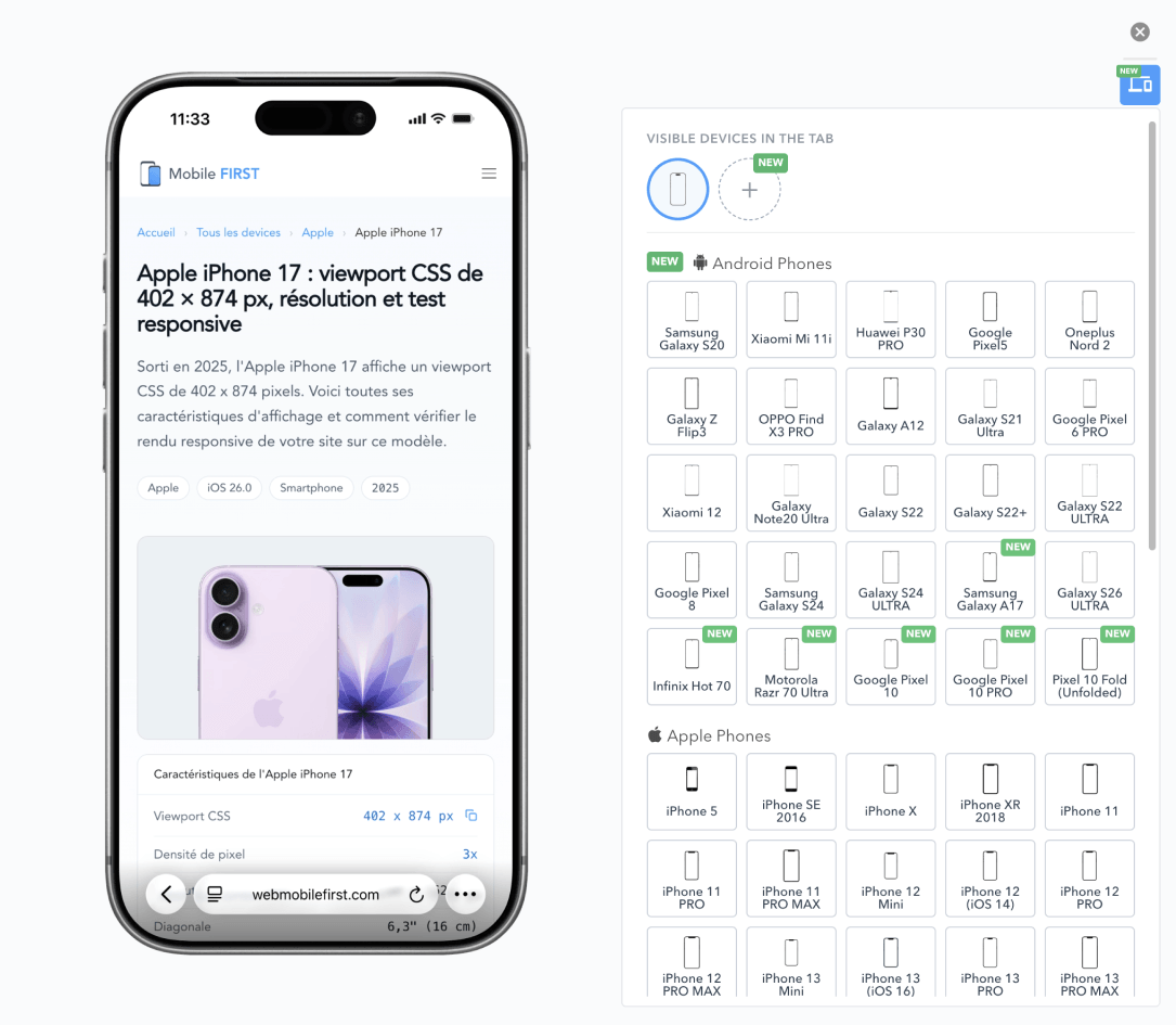
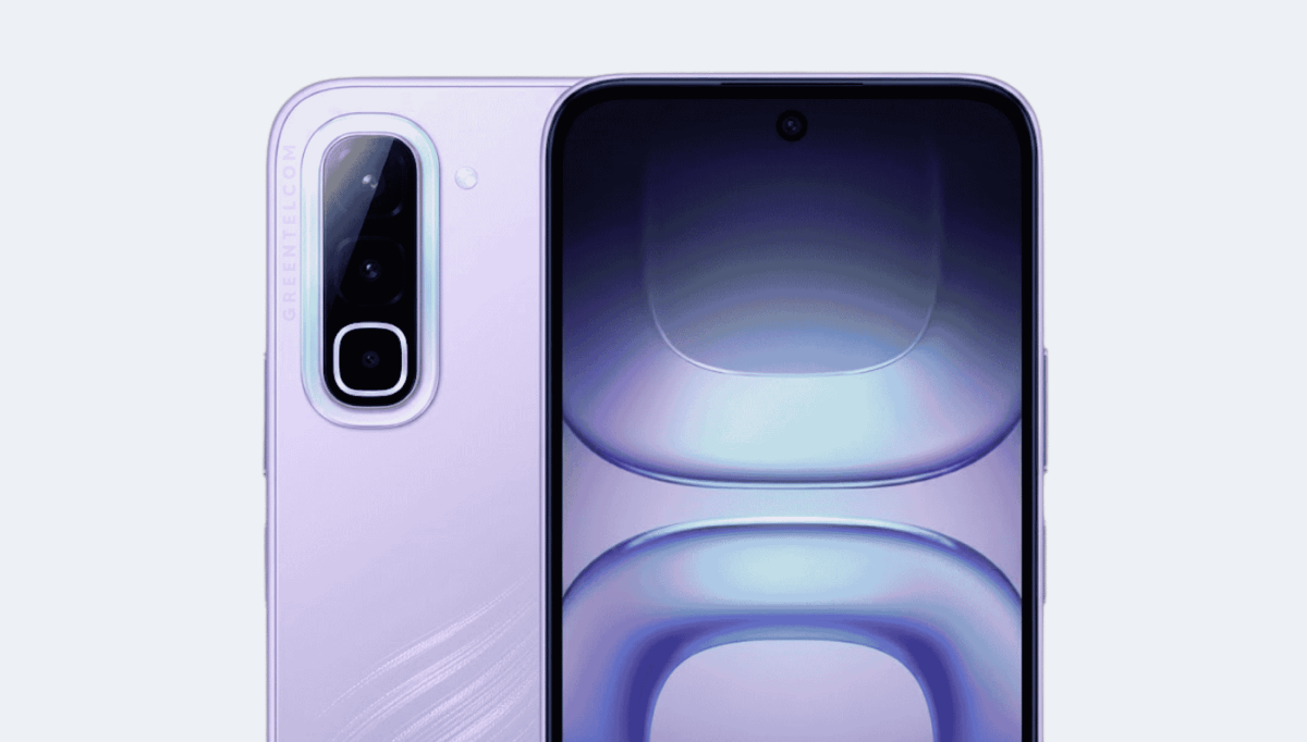
An Android phone displaying a site in mobile view in the Mobile FIRST Android emulator, next to the device selection panel

Why test your site on Android?

8 CSS widths among 9 manufacturers

Android has no reference device: the 31 models in the emulator are spread across 8 different widths, from 360 to 884 px. Validating the one you have on hand says nothing about the others, and the gap widens with each new manufacturer added to the catalog.

9 pixel densities, including 5 fractional

From 1x to 4x, and especially values like 2.625x and 2.75x that no iPhone displays. A CSS pixel does not fall on a whole number of physical pixels: pixel borders thicken or disappear, and an image served at @2x or @3x is never at the correct scale.

2 models exceed 700 px in portrait

Up to 884 px wide without being rotated, while the User-Agent indicates a mobile. A layout that chooses its template based solely on width thus serves its tablet version, with menus sized for a mouse and touch areas too small.

Emulate an Android device in three steps

No SDK, no multi-gigabyte system image, no hardware acceleration to enable: the emulator applies to the tab you already have open.

  1. 01 Install the extension On Chrome, Firefox, or Edge, from the official store. Free, no account to create, and without the gigabytes of an SDK.
  2. 02 Choose an Android device from the list The 31 models are sorted by manufacturer and generation. The site reloads with the viewport, density, and User-Agent of the chosen model.
  3. 03 Compare two manufacturers, capture Display a Pixel and a Galaxy side by side to see which of the two widths breaks the layout, switch to landscape, export a cropped capture or a video.

The 31 Android devices in the emulator

31 models · 2019 → 2026

9 manufacturers — Samsung, Google, Xiaomi and 6 others — and 8 distinct CSS widths: this is the range that a site's media queries must cover. The table provides the measurements of each model, and each row links to its complete profile.

CSS viewport, pixel density, resolution, and diagonal of the emulated Android devices
Model CSS Viewport Density Panel resolution Diagonal Year
Galaxy S26 ULTRA 412 × 891 4x 1648 × 3564 2026
Google Pixel 10 412 × 924 2.625x 1082 × 2426 2026
Google Pixel 10 PRO 410 × 912 3.125x 1281 × 2850 2026
Infinix Hot 70 360 × 788 2x 720 × 1576 2026
Motorola Razr 70 Ultra 412 × 1008 3x 1236 × 3024 2026
Pixel 10 Fold (Unfolded) 412 × 901 2.625x 1082 × 2365 2026
Samsung Galaxy A17 412 × 892 2.625x 1082 × 2342 2025
Google Pixel 8 412 × 915 2.625x 1080 × 2400 2024
Samsung Galaxy S24 360 × 780 3x 1080 × 2340 2024
Samsung Galaxy S24 Ultra 384 × 832 2.8125x 1440 × 3120 2024
Samsung Galaxy S22 360 × 780 3x 1080 × 2340 6.1" 2022
Samsung Galaxy S22 ULTRA 360 × 772 4x 1440 × 3088 6.8" 2022
Samsung Galaxy S22+ 360 × 780 3x 1080 × 2340 6.6" 2022
Xiaomi 12 2022 360 × 800 3x 1080 × 2400 6.7" 2022
Google Pixel 6 PRO 360 × 780 4x 1440 × 3120 6.7" 2021
OnePlus Nord 2 412 × 915 2.625x 1080 × 2400 6.4" 2021
OPPO Find X3 PRO 360 × 804 4x 1440 × 3216 6.7" 2021
Samsung Galaxy A12 360 × 800 2x 720 × 1600 2021
Samsung Galaxy S21 360 × 800 3x 1080 × 2400 6.2" 2021
Samsung Galaxy S21 Ultra 360 × 800 4x 1440 × 3200 6.8" 2021
Samsung Galaxy Z Flip3 360 × 880 3x 1080 × 2640 6.7" 2021
Xiaomi Mi 11i 360 × 800 3x 1080 × 2400 6.7" 2021
Google Pixel 5 393 × 851 2.75x 1080 × 2340 6" 2020
Samsung Galaxy Note20 Ultra 412 × 883 3.5x 1440 × 3088 6.9" 2020
Samsung Galaxy S20 360 × 800 3x 1440 × 3200 6.4" 2020
Samsung Galaxy Z Fold 2 884 × 1104 2x 1768 × 2208 7.6" 2020
Huawei P30 PRO 360 × 780 3x 1080 × 2340 6.5" 2019
Samsung Galaxy Fold 768 × 1076 2x 1536 × 2152 7.3" 2019
Generic device on Android 360 × 800 2x 720 × 1600 6.7"
Zebra MC330 480 × 800 1x 480 × 800
Zebra TC78 412 × 818 2.625x 1082 × 2147

Which Android screen widths to test first

Two widths are enough to cover most of the range: 360 and 412 px alone account for 25 of the 31 models in the table. These should receive your first breakpoints before adding others as needed.

The 6 remaining widths each belong to only one model and go up to 884 px: unfolded screens, rugged terminals, manufacturer-specific formats. They don't each deserve a breakpoint, but a layout that holds at 360 px and remains readable at 884 px absorbs them all.

Beware of height under Chrome Android: the URL bar retracts on scroll and the gesture navigation bar encroaches on the bottom of the screen. A height of 100vh thus overflows the first screen, while svh and dvh units give the actual displayed value. Also declare a theme-color: it tints the browser bar, and its absence breaks a colored header.

Serve your images in srcset with width descriptors rather than @2x and @3x. Android densities rarely fall on a whole number: a set of files indexed on exact multiples forces the browser to resize, which softens flat areas and embedded text.

Browser Android emulator, Android Studio, or DevTools?

A full-system emulator, like the virtual device in Android Studio, runs a real Android: complete system image, virtual machine, hardware acceleration. It's the only way to reproduce a WebView bug, test a native app, or an older version of Chrome. It's also several gigabytes to download and a minute to start, and it doesn't open in the middle of an integration session.

A browser Android emulator, on the other hand, is a simulator: it runs no system, it replicates the display conditions of a device in the browser you already have open. This is what Mobile FIRST does for 31 models from 9 manufacturers, with their viewport, density, User-Agent, and touch events, on Windows, macOS, or Linux.

The responsive mode of DevTools resizes the window and changes the User-Agent. It's an inspection tool: no device frame, one screen at a time, and nothing to show a client. Remote debugging via USB, however, is perfectly accurate — but it only covers the model you have on your desk.

The limitation of simulation is always the same, and it's better to know it: the rendering engine remains that of your browser. It covers layout, breakpoints, density, and touch behavior; for behavior specific to a manufacturer's WebView, a real device or emulator is still necessary.

31 Android devices in your browser, with nothing to install

The tables provide the measurements. The extension displays your site at the model's exact viewport, with its density, User-Agent, and portrait or landscape switch.

  • 31 ready-to-use devices, from 9 different manufacturers
  • Viewport, fractional density, and real Android User-Agent
  • Two manufacturers side by side to spot regressions
  • Works on localhost and preproduction

Free · 4.9/5 on 5,100 reviews
1,500,000+ users

Frequently asked questions

What is the CSS viewport of an Android phone?

There isn't just one: the 31 devices in the emulator cover 8 widths, from 360 to 884 px. The most common is 360 px, shared by 16 models. It's this width in CSS pixels, not the panel resolution, that your media queries read.

What is the difference between an Android emulator and an Android simulator?

An emulator runs a complete Android system in a virtual machine: this is what Android Studio provides, and it requires several gigabytes and a capable machine. A simulator only replicates the display conditions of the device — viewport, density, User-Agent, gestures — in an already open browser. For responsive web, the latter suffices and starts instantly.

Do you need to install Android Studio or an SDK?

No. The extension installs on Chrome, Firefox, and Edge, on Windows, macOS, and Linux, without SDK, system image, or BIOS virtualization activation.

Does the emulator really use Chrome Android?

It replicates the viewport, pixel density, User-Agent, and touch gestures of the device in your browser's engine. This covers layout, breakpoints, and touch behavior. For a bug specific to a manufacturer's WebView or an older version of Chrome, a real device or emulator is needed.

How many Android devices does the extension offer?

31 preconfigured models from 9 manufacturers, from the newest to the oldest, updated with each release. The 81 other Android devices in the catalog each have their technical sheet on the site: enter their width and density in a custom device to find them in the list.

What User-Agent does the simulator announce?

That of the chosen device, as it actually sends it. For Galaxy S26 ULTRA under Android 16.0, it is: Mozilla/5.0 (Linux; Android 16; SM-S948B) AppleWebKit/537.36 (KHTML, like Gecko) Chrome/142.0.0.0 Mobile Safari/537.36. Servers and detection scripts thus see an Android phone, not your desktop browser.

Can you test a foldable screen?

Yes: 2 models in the table exceed 700 px wide in portrait, up to 884 px. It's the width at which a layout switches to its tablet template while the device remains a phone, and it's the test case most often skipped.

Does the emulator replicate screen density?

Yes, including fractional values: the table lists 9, from 1x to 4x. This allows you to see on which models a too-small image becomes blurry, and where a one-pixel CSS border starts jumping from line to line.

Can you test a localhost site on an emulated Android device?

Yes. The extension applies to the current tab regardless of the URL: production, preproduction, or local server during development. This distinguishes it from online simulators, which do not see your machine.

Android, Chrome, Pixel, and Android Studio are trademarks of Google LLC. Galaxy is a trademark of Samsung Electronics. Mobile FIRST is not affiliated with or endorsed by any of these manufacturers.