Laptops narrower than you think
Despite their high resolution, MacBooks display 1204 to 1736 CSS px wide, and often less once the window is resized. A layout designed on a large external monitor can feel cramped there.
7 Macs to simulate · 1204 to 2560 px · Retina screen
The extension reproduces in your browser the CSS viewport, Retina density and User-Agent of 7 Macs, from a 1204 px wide MacBook to a 2560 px desktop display. The table gives the measurements of each model, and each row links to its full spec page.


1,600,000+ installations · 4.93/5 on the Chrome Web Store
Free installation in seconds · computer only

Despite their high resolution, MacBooks display 1204 to 1736 CSS px wide, and often less once the window is resized. A layout designed on a large external monitor can feel cramped there.
Each CSS pixel is rendered by 2 physical pixels. Images and icons without a high-resolution version look blurry, which you do not see on a standard 1x desktop monitor.
The menu bar, the Dock and the browser toolbar take a good share of the height. On a laptop, what must fit above the fold (the headline, the call to action) has much less room than on the screen where the site was designed.
No Mac, no account, no virtual machine: the simulator applies to the open tab.
MacBooks range from 1204 to 1736 px wide, desktop displays go up to 2560 px. All of them run at 2x density.
| Model | CSS Viewport | Density | Panel resolution | Diagonal | Year |
|---|---|---|---|---|---|
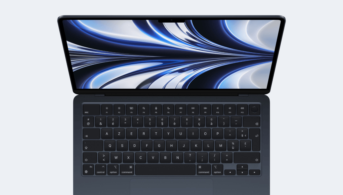
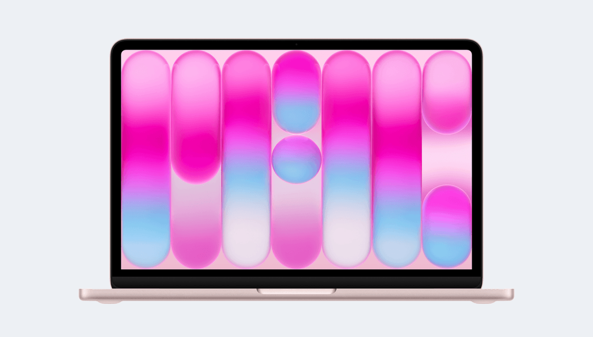
| Apple MacBook Air M5 13" | 1470 × 956 | 2x | 2560 × 1664 | 13.6" | 2026 |
| Apple MacBook Neo 13" | 1204 × 753 | 2x | 2408 × 1506 | — | 2026 |
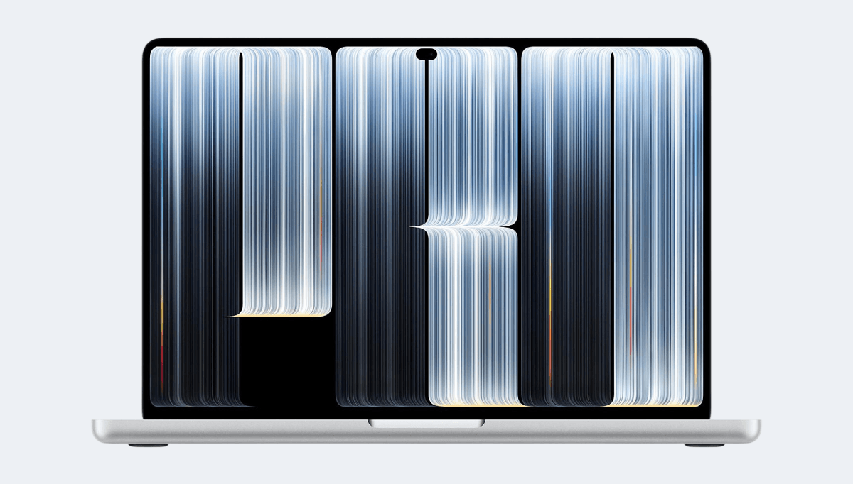
| Apple MacBook Pro M5 16" | 1736 × 1133 | 2x | 3472 × 2266 | 16.3" | 2026 |
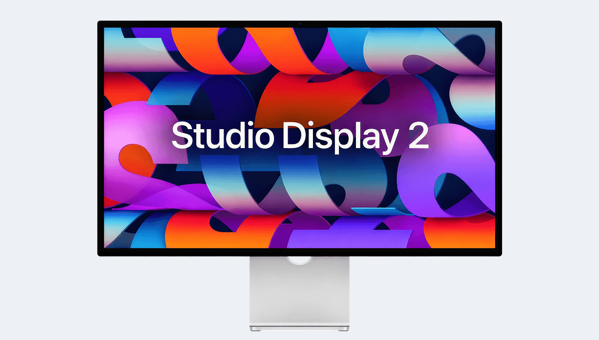
| Apple Studio Display 27" | 2560 × 1440 | 2x | 5120 × 2880 | 27" | 2026 |
| Apple MacBook Pro M1 16" | 1728 × 1117 | 2x | 3456 × 2234 | 16.2" | 2021 |
| iMac 24" | 2048 × 1152 | 2x | 4096 × 2304 | 9.3" | 2021 |
| Apple MacBook Air 2020 13" | 1280 × 800 | 2x | 2560 × 1600 | 13.3" | 2020 |
The MacBooks in the simulator are 1204, 1280, 1470, 1728 and 1736 px wide. These are the widths a site should fill well first: a layout capped at 1920 px gains nothing there, a layout designed for 1024 px leaves large empty margins.
Check the narrower window too. On a laptop, the browser often shares the screen with another app: a half-width window falls on your tablet tier, with a mouse and a keyboard.
On a Retina screen, serve images at double resolution with srcset or image-set(), and prefer SVG for logos and icons. A 0.5 px border is visible there, which is not the case at 1x.
No extension runs macOS. To run the system itself, you need a Mac, or a Mac rented in the cloud: Apple only allows macOS in a virtual machine on Apple hardware.
What Mobile FIRST reproduces are the dimensions of a Mac for your site: the CSS viewport, the Retina density and the Safari on macOS User-Agent, on Windows, Linux or macOS. That is what you need to check a layout at MacBook widths.
The rendering engine stays your browser's. To validate Safari-specific behavior, test on a real Mac or on a cloud-hosted device.
The table gives the measurements. The extension displays your site at the exact viewport of the model, with its density and its User-Agent, next to smartphones and tablets.
Free · 4.93/5 on 5,100 reviews
1,600,000+ users
It ranges from 1204 to 1736 px wide across the MacBooks in the simulator, at 2x density. The panel resolution is much higher, but the width in CSS pixels is what your media queries read.
No. The extension displays your site at the dimensions of a Mac, with its density and User-Agent, in your browser. Running macOS requires a Mac, physical or rented in the cloud.
Yes. On Windows or Linux, the extension gives the open tab the CSS width and Retina density of the chosen Mac, from MacBook Air to iMac. A quick way to check that a layout designed on a large PC monitor still holds on an Apple laptop.
7 preconfigured models: MacBook Airs, MacBook Pros and desktop displays. For a model that is not in the list, create a custom device with the width, height and density from its spec page.
That of the chosen device, as the extension sends it. For Apple MacBook Air M5 13" running macOS 26.0, it is: Mozilla/5.0 (Macintosh; Intel Mac OS X 10_15_7) AppleWebKit/605.1.15 (KHTML, like Gecko) Version/26.0 Safari/605.1.15.
Yes. The extension acts on the current tab, whatever its address: local server, staging or production. You can check the first screen at a MacBook's height while you develop, without deploying for every tweak.
MacBook, iMac, macOS and Safari are trademarks of Apple Inc. Mobile FIRST is not affiliated with or endorsed by Apple.