Right on the tablet breakpoint
In portrait, an iPad is 768 to 834 px wide: exactly where most frameworks put their first tablet breakpoint. A one-pixel difference in a media query is enough to serve it the mobile layout or the tablet layout.
4 iPads to simulate · 768 to 834 px · portrait and landscape
The extension reproduces in your browser the CSS viewport, pixel density, User-Agent and touch gestures of 4 iPads, from 768 px wide in portrait to 1194 px in landscape. The table gives the measurements of each model, and each row links to its full spec page.


1,600,000+ installations · 4.93/5 on the Chrome Web Store
Free installation in seconds · computer only
In portrait, an iPad is 768 to 834 px wide: exactly where most frameworks put their first tablet breakpoint. A one-pixel difference in a media query is enough to serve it the mobile layout or the tablet layout.
Rotated to landscape, an iPad reaches 1194 px and triggers your desktop media queries. The site then shows its desktop menus and columns, but the screen is still touch-only: that is where hover menus stop working.
Each CSS pixel is rendered by 2 physical pixels, on a much larger surface than a phone. Images that are too light, which go unnoticed on a smartphone, look blurry across the whole width.
No Mac, no account, no system image download: the simulator applies to the open tab.
In portrait, the selection covers 3 CSS widths: 768, 820 and 834 px. In landscape, the same iPads range from 1024 to 1194 px.
| Model | CSS Viewport | Density | Panel resolution | Diagonal | Year |
|---|---|---|---|---|---|
| Apple iPad A16 11" | 820 × 1180 | 2x | 1640 × 2360 | 11" | 2025 |
| Apple iPad Mini (6th Gen) | 768 × 1024 | 2x | 1536 × 2048 | 7.9" | 2021 |
| Apple iPad Air 4 | 820 × 1180 | 2x | 1640 × 2360 | 9.7" | 2020 |
| Apple iPad PRO 11" (3rd Gen) | 834 × 1194 | 2x | 1668 × 2388 | 11" | 2018 |
In portrait, test 768, 820 and 834 px: these are the widths of the whole selection. A rule written as min-width: 768px applies to all of them; written as min-width: 800px, it excludes Apple iPad Mini (6th Gen). Decide explicitly which side of the line your iPads should fall on.
In landscape, the width goes from 1024 to 1194 px. A desktop layout built for 1280 px does not fit: check that it collapses cleanly between 1024 and 1280 px instead of showing a horizontal scrollbar.
In Split View or Slide Over, Safari only takes part of the screen and drops to a phone width. A site that assumes an iPad is always wide breaks in this mode, which is widely used on the larger models.
An iPad has no hover. Restrict hover dropdowns to devices that support it with the (hover: hover) media query, and keep a touch version for the others: a landscape iPad showing the desktop navigation needs it.
On most iPads, Safari requests the desktop version of sites by default and presents itself with a Mac User-Agent. A site that detects tablets by their User-Agent therefore does not recognize the iPad: detection has to rely on capabilities, such as navigator.maxTouchPoints or the (pointer: coarse) media query.
The Xcode simulator runs a real iPadOS and a real Safari, but it requires a Mac and several gigabytes of downloads. DevTools responsive mode resizes the window without a device frame or realistic touch gestures, one screen at a time.
Mobile FIRST reproduces the viewport, density, iPad User-Agent and touch events of 4 iPads in the browser you already have open, on Windows, macOS or Linux, and shows several devices side by side. The rendering engine stays your browser's: for WebKit-specific behavior, a cloud-hosted device or Apple's simulator are still needed.
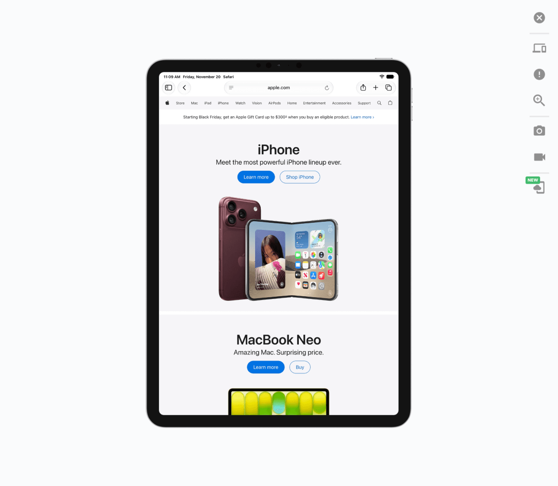
The table gives the measurements. The extension displays your site at the exact viewport of the model, with its density, its User-Agent and the portrait or landscape switch.
Free · 4.93/5 on 5,100 reviews
1,600,000+ users
From 768 to 834 px wide in portrait across the 4 iPads in the simulator, and from 1024 to 1194 px in landscape. This width in CSS pixels, not the panel resolution, is what your media queries read.
Neither by default: its width decides. In portrait, it falls on the tablet tier; in landscape, on the desktop tier. What does not change is touch: hover interactions must always have a touch equivalent.
Yes. The extension runs in Chrome, Firefox and Edge, on Windows, macOS or Linux. Where the Xcode simulator requires a Mac and a download of the iPadOS runtime, it simply fits the open tab to the chosen iPad's dimensions, in portrait and landscape alike.
4 preconfigured models, updated with every release. For an iPad that is not in the list, create a custom device with the width, height and density from its spec page.
That of the chosen device, as the extension sends it. For Apple iPad A16 11" running iPadOS 27.0, it is: Mozilla/5.0 (iPad; CPU OS 27_0 like Mac OS X) AppleWebKit/605.1.15 (KHTML, like Gecko) Version/27.0 Mobile/15E148 Safari/604.1.
Yes. The simulator applies to the current tab, including localhost or a password-protected staging site. You can rotate the iPad and check the landscape layout while you develop, before anything goes live, which an online simulator loading the page from its own servers cannot do.
iPhone, iPad, Safari, and Xcode are trademarks of Apple Inc. Mobile FIRST is neither affiliated with nor endorsed by Apple.