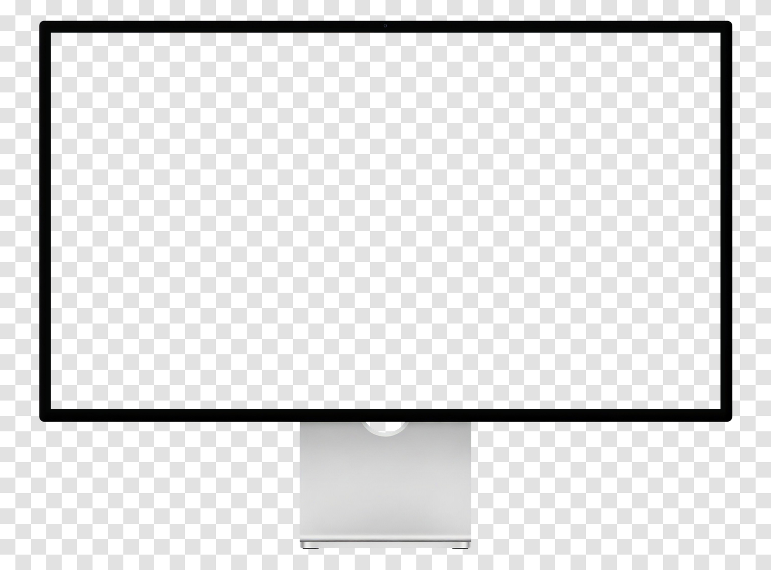
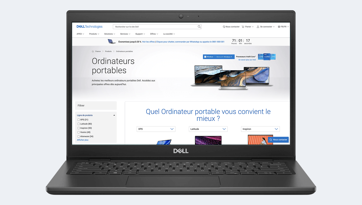
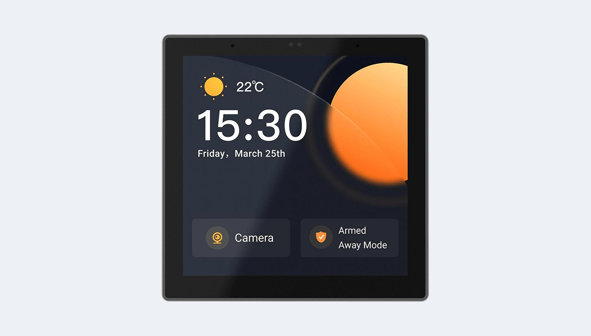
Large screen rendering
Testing on Apple Studio Display 27" checks the other end of responsive: maximum container widths, line lengths, and empty spaces that appear beyond your last breakpoints.
Apple · macOS 27.0 · Computer · 2026
All display characteristics of Apple Studio Display 27", computer Apple from 2026: CSS viewport of 2560 x 1440 pixels, 2x density, media queries, and one-click responsive test.
Test your site on Apple Studio Display 27" directly in your browser, without buying the device.
4.93/5 based on 5,100 reviews · 1,600,000 users · free
Testing on Apple Studio Display 27" checks the other end of responsive: maximum container widths, line lengths, and empty spaces that appear beyond your last breakpoints.
With a density of 2x, Apple Studio Display 27" provides a useful benchmark to ensure your images remain sharp without serving unnecessarily large files.
This model is representative of WIFI usage. Testing on it ensures your page remains usable when images and fonts load slowly.
This is the resolution that interests designers and developers the most, as it determines breakpoints and the definition of media queries. In practice, it's the only one mentioned in a stylesheet.
The height remains indicative: Safari, Chrome, and other mobile browsers reduce the visible area with their address bar, which folds on scroll.
Be cautious when analyzing your statistics: some tools only report the manufacturer resolution, never the CSS viewport presented here.
2
The device pixel ratio of Apple Studio Display 27" is 2.
In other words, a 1-pixel square in CSS occupies 2 pixels on the panel. An image exported at actual size will appear blurry.
This resolution is the hardware's. It explains the display's sharpness, but it's never the one to target in a media query.
218 pixels per inch (ppi) · 27 inches diagonal, or 68.6 cm
This string is what the browser of Apple Studio Display 27" sends. It is useful for your automated tests, reading your server logs, and server-side detection.
User-Agent string used by Apple Studio Display 27", useful for your automated tests and logs.
Mozilla/5.0 (Macintosh; Intel Mac OS X 10_15_7) AppleWebKit/605.1.15 (KHTML, like Gecko) Version/27.0 Safari/605.1.15These snippets are generated from the exact characteristics of Apple Studio Display 27". Copy them directly into your stylesheet or configuration.
Targets screens whose width matches that of Apple Studio Display 27" and models of the same format.
@media only screen and (min-width: 1440px) and (max-width: 2559px) {
  /* Apple Studio Display 27" */
}Serves high-resolution images to screens of at least 2x.
@media only screen and (-webkit-min-device-pixel-ratio: 2),
       only screen and (min-resolution: 192dpi) {
  /* High-density images and icons */
}Adds a named breakpoint at the exact width of Apple Studio Display 27".
// tailwind.config.js
module.exports = {
  theme: {
    screens: {
      'apple-studio-display-27-inches-2026': '2560px'
    }
  }
}Detects format and density client-side.
const isDeviceWidth = window.matchMedia('(min-width: 2560px)').matches;
const isHighDensity = window.devicePixelRatio >= 2;Essential for Apple Studio Display 27" to use its CSS viewport and not a simulated width of 980 pixels.
<meta name="viewport" content="width=device-width, initial-scale=1">Mobile FIRST includes Apple Studio Display 27": your page displays in a viewport of 2560 x 1440 pixels, with the model's User-Agent, touch events, and scrolling behavior of a real mobile.
This is where the difference with Chrome DevTools' responsive mode is seen: DevTools resizes a window, the extension replicates the device's browser and allows exporting shareable screenshots and videos.
The neighboring formats of Apple Studio Display 27" are the ones to test right after, as they reveal poorly placed breakpoints.
| Model | CSS Viewport | Pixel density | Manufacturer resolution |
|---|---|---|---|
| Apple Studio Display 27" | 2560 x 1440 | 2x | 5120 x 2880 |
| Apple MacBook Air M5 13" | 1470 x 956 | 2x | 2560 x 1664 |
| Apple MacBook Pro M5 16" | 1736 x 1133 | 2x | 3472 x 2266 |
| Samsung Smart TV NEO QLED 4K 55" | 1920 x 1080 | 2x | 3840 x 2160 |
| Samsung The Frame 4K QLED 65" TV | 1920 x 1080 | 2x | 3840 x 2160 |
| Samsung Smart TV | 1920 x 1080 | 1x | 1920 x 1080 |
| iMac 24" | 2048 x 1152 | 2x | 4096 x 2304 |
The CSS viewport of Apple Studio Display 27" measures 2560 pixels wide and 1440 pixels high. This is the width to use for defining your media queries, not the manufacturer's resolution.
The device pixel ratio of Apple Studio Display 27" is 2. Each CSS pixel is thus displayed by 2 physical pixels, requiring you to provide your images in 2x to keep them sharp.
The panel of Apple Studio Display 27" displays 5120 x 2880 physical pixels. This is the value reported by most analytics tools, while your CSS works on a viewport of 2560 x 1440 pixels.
The User-Agent of Apple Studio Display 27" is: Mozilla/5.0 (Macintosh; Intel Mac OS X 10_15_7) AppleWebKit/605.1.15 (KHTML, like Gecko) Version/27.0 Safari/605.1.15
Install the Mobile FIRST extension on Chrome, Firefox, or Edge, then select Apple Studio Display 27". Your page displays in a viewport of 2560 x 1440 pixels with the corresponding mobile User-Agent, in two clicks and for free.
DevTools resizes the window and applies partial emulation. Mobile FIRST additionally applies the User-Agent of Apple Studio Display 27", touch events, scroll behavior, and the actual appearance of the device, and allows capturing directly usable images and videos.
Yes. The extension works on any URL open in your browser, including localhost:3000, 127.0.0.1, or a password-protected pre-production environment.
No. The simulation covers the vast majority of development needs at no cost. A final test on a cloud-hosted device is still recommended before critical production deployment, but it's no longer necessary for each iteration.
A media query on the exact width targets Apple Studio Display 27": @media only screen and (min-width: 2560px). Combine it with the pixel density to precisely target this model and those sharing its format.
Without buying a single phone, without creating an account.
Free installation in seconds · computer only