OPPO range resolutions
The CSS viewport is the width your media queries work on. The manufacturer resolution is the number of physical pixels on the panel: it's the value reported by most statistics tools.
| Model | CSS Viewport | Density | Manufacturer resolution | Diagonal | Year |
|---|---|---|---|---|---|
| OPPO Find X3 PRO | 360 x 804 | 4x | 1440 x 3216 | 6.7" | 2021 |
Test your site on a OPPO device
The Mobile FIRST extension replicates the viewport, User-Agent, and touch events of 1 OPPO devices. You check your responsive rendering from your browser, including on a localhost address.
Test your site on OPPO Find X3 PRO directly in your browser, without buying the device.
- OPPO Find X3 PRO available in the device list
- Real viewport, User-Agent, and touch events
- Also works on localhost and in pre-production
- Exportable screenshots and videos
Latest OPPO models
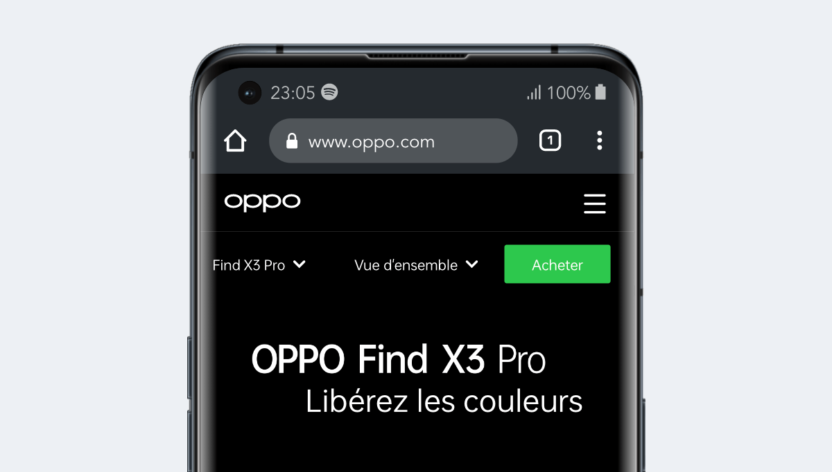
OPPO Find X3 PRO
Smartphone of 6.7 inches released in 2021, viewport of 360 x 804 px and density of 4x.
View specifications